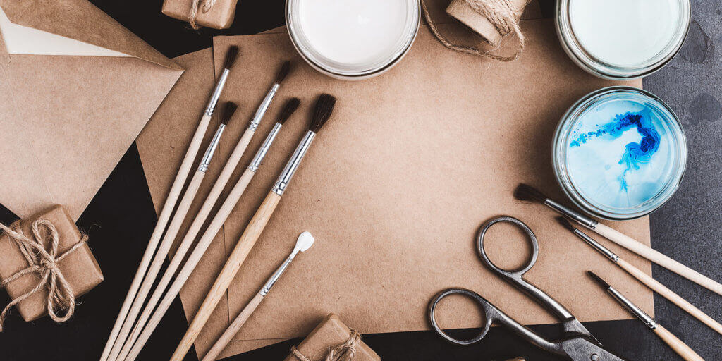
People are naturally predisposed to put things into boxes. The main motive behind product packaging design is to create an external container people will want to pick up and look at more closely.
The contents of the box matter, of course, just as much as the container. But a high-quality product usually comes in a high-quality box or container — at least in the minds of consumers. There are video bloggers whose entire channels are devoted to unboxing tutorials. These are considered both demonstrations and reviews of the unboxing process for a given product. These videos are incredibly popular, but why?
Design Aesthetics
Product packaging refers to all the decisions that go into the exterior of product. Someone in a room somewhere is thinking not only about graphics, fonts, and color schemes, but also materials, forms, shapes, functionality. They’re making design choices that affect cost, distribution, sales, and popularity.
The function of the container is also sometimes predicated on the type of product going inside it. A bottle of beer or a box of cereal is a form we recognize immediately, but what about other products? What about medication for pets, nutraceuticals, and other herbal supplements?
Who Are You Selling To?
Design is often informed not only by content and function, but also by audience. There are a lot of tactics that effectively communicate to the people you want to sell to that you want them to be interested in your market. Think of a box of cereal, for example. The breakfast cereal market is valued at approximately $40 billion USD, and if you want a piece of it (or a bowl, as the case may be), you need to be able to target that audience.
If you’re making a cereal aimed specifically at children, there are multiple tactics to engage and intrigue that specific audience. Colorful inks, a sense of adventure, the idea that breakfast is a form of play, and don’t forget, a whimsical cartoon mascot. If you look at the eyes of the cartoon characters currently adorning the cereal boxes in the supermarket, their line of site scans downward, towards the approximate height of small child, walking alongside a taller parent.
Packaging Storytelling
No need to stop there! Think of all the modern printing applications that could add bells and whistles to the visual story the package design is telling. We live in a professional printing Renaissance of sorts, able to draw the eye with intricate reticulation patterns, the brightest and boldest press-on holographic stickers, glitter coating, and so much more!
However, if you’re targeting a more mature audience, your packaging design wildly shifts. Gone are the bright and vibrant colors. Instead of adventure, the text and imagery are going to focus on the health benefits of your cereal — the kinds of values an adult is going to use when shopping. A zoomed-in image of a single kibble to showcase its texture and flavor also falls within best practice.
A Delicate Balance
Package design will always have two main components: images and copy. Some companies like to merge these and have the copy arrayed in such a way that it displays an image. You’re going to typically want your company logo and branding efforts on full display.
Depending on the type of product, copy may be mandated by regulations and other standards and practices. In this area, Lofton has a lot of experience, specializing in the kinds of finite spaces on the sides of pill bottles needed to convey your company’s image, brand, personality, and crucial (sometimes legally required) information.
ECLs
A real space-saver in the latter example is the extended content label, also known as ECLs. Especially when there are lot of details to fit onto a small amount of space, such as the side of the bottle to display regulatory requirements or instructional information, ECLs function perfectly. Our ELCs are of the highest quality, thanks to a pressure-sensitive label with an offset printed insert.
It’s overall the best way to deliver high-integrity labels for chemical applications, coupons, prize piece giveaways, and so much more.
We’re Here to Help
Designing the perfect package is only the first step. For high-quality, high-value label printing services, look no further than Lofton Label as your top-of-the-line label printing authority.
We have a quality of product matched only by the quality of the services we provide our clients. We exclusively partner with Universal Labeling Systems for the best possible printing machines and devices. We make our own ink, and in the near future our production and offices will be completely sustained on a wind-energy-only power grid. Contact us for any design questions you might have.
